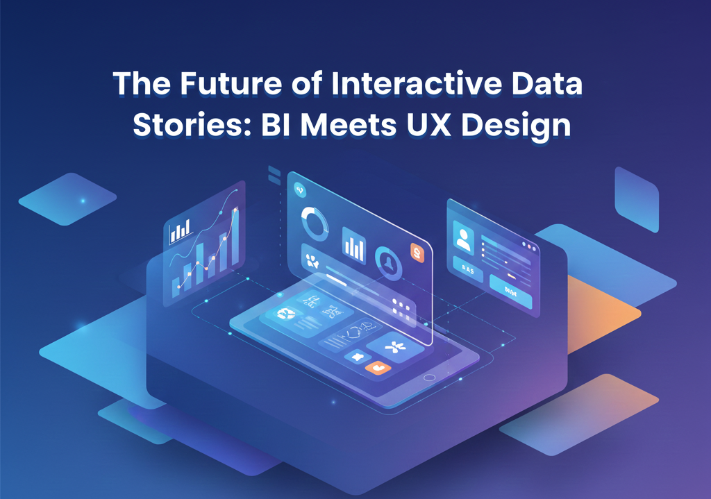
The Future of Interactive Data Stories: BI Meets UX Design
The Future of Interactive Data Stories: BI Meets UX Design
Business Intelligence (BI) has always been about turning raw information into insights. But in today’s digital environment – where decision-makers expect clarity, speed, and impact – traditional dashboards are no longer enough. Leaders want data that speaks, not just data that shows. This shift has given rise to a new frontier in analytics: interactive data stories, where BI and UX design converge to create experiences that are intuitive, narrative-driven, and deeply engaging.
Data stories are evolving from static visualizations into immersive, interactive journeys. They allow users to explore insights at their own pace, switch perspectives, follow guided narratives, and uncover hidden patterns with ease. As BI tools integrate modern UX principles, data storytelling is transforming into a dynamic discipline that blends analytics, design, and user psychology – all aimed at improving decision-making.
Why Interactive Data Stories Are Becoming Essential
Organizations are generating more data than ever, but insight gaps are widening. Many teams struggle with dashboards that feel cluttered, overwhelming, or disconnected from real business context. Decision-makers don’t want rows of charts; they want a compelling narrative that explains what happened, why it happened, and what they should do next.
Interactive data stories solve this challenge by combining structure with flexibility. They guide users through meaningful insights while still allowing exploration. Instead of dumping data onto a screen, they shape an experience – much like a well-designed app or a thoughtfully crafted digital journey.
Several trends are driving the rise of interactive data storytelling:
-
Decision-makers want insights with clear business relevance
-
Users expect consumer-grade experiences from enterprise tools
-
Complex data needs context and explanation, not just visualization
-
BI teams are shifting from dashboard creators to experience designers
-
Organizations want analytics that drive action, not just information
When BI meets UX, dashboards evolve into products – built with intention and designed for usability.
What Makes an Interactive Data Story Different
An interactive data story goes beyond charts and KPIs. It creates a narrative arc with clear sections, purposeful transitions, and intuitive controls. This approach blends storytelling techniques with analytical depth.
Elements that define interactive data stories include:
-
Narrative flow, guiding users through insights step by step
-
Progressive disclosure, revealing details as the user interacts
-
Contextual explanations, making insights clearer and more relatable
-
Branching exploration, allowing users to dive deeper only where needed
-
Interactive visuals, such as animations, filters, sliders, and hover states
-
UX patterns, ensuring consistency, clarity, and ease of use
The result is a more natural, human-centric journey – one that supports both quick decision-making and deep analytical exploration.
How BI and UX Design Are Converging
UX design has long focused on usability, accessibility, and emotional engagement. BI has traditionally focused on analytical accuracy and visualization best practices. The future of analytics blends both disciplines to create experiences that:
-
Guide attention to what matters
-
Reduce cognitive load
-
Encourage exploration without overwhelming
-
Present insights using familiar interaction patterns
-
Build trust through clarity and transparency
This convergence requires new skills across BI teams, including information architecture, design thinking, layout strategy, and storytelling techniques.
The Science Behind Effective Data Stories
Modern UX principles play a huge role in how users absorb information. Interactive data stories leverage these principles intentionally.
Hierarchy and Layout
The most important insights sit at the top or at the center of the experience. Supporting visuals follow logically, allowing users to scan quickly.
Color and Contrast
Instead of decorative color, data stories use color to highlight trends, risks, opportunities, and comparisons.
Cognitive Load Reduction
By revealing details progressively, users aren’t overwhelmed. They see only what they need at each stage.
Micro-interactions
Small actions – hover highlights, animations, tooltips – help users understand data relationships more intuitively.
Narrative Cues
Headings, annotations, and short text blocks provide context without creating clutter.
As BI teams apply these UX principles, dashboards evolve into experiences that match the clarity and polish of modern digital products.
Use Cases Where Interactive Data Stories Shine
Interactive data stories are particularly valuable when insights are complex, multi-layered, or used by diverse audiences.
Executive Decision-Making
Leaders can scan high-level insights, then drill down only when needed – saving time and improving clarity.
Customer and Market Analysis
Interactive stories reveal trends, segment behaviors, and competitive dynamics in a guided flow.
Operational Monitoring
Teams can explore root causes behind changes in KPIs through intuitive transitions and drill paths.
Financial Planning and Forecasting
Interactive scenarios and what-if simulations help decision-makers visualize possible outcomes.
AI and Machine Learning Explainability
Data stories break down model predictions into simple, human-understandable narratives.
Technology Enabling the Next Generation of Data Stories
BI platforms and design tools are rapidly evolving to support richer storytelling experiences.
Capabilities driving this evolution include:
-
Embedded analytics, bringing interactive insights into apps and workflows
-
Advanced UI components, such as storyboards, guided walkthroughs, and animations
-
Generative AI, enabling automatic narrative creation and contextual explanations
-
Low-code UX layers, letting BI teams design sophisticated experiences without heavy development
-
Mobile-first design, ensuring interactive stories work across all devices
These capabilities make it easier for organizations to deliver polished, user-friendly data experiences at scale.
Challenges Organizations Face
Despite the promise of interactive data storytelling, several challenges slow adoption:
-
Legacy dashboards that prioritize charts over narrative
-
BI teams lacking UX training
-
Data clutter and inconsistent design standards
-
Tools not optimized for storytelling workflows
-
Stakeholders unfamiliar with interactive exploration
-
Time constraints limiting design experimentation
Addressing these challenges requires a mindset shift – from focusing on visualizing data to designing data experiences.
Why Interactive Stories Will Shape the Future of BI
As expectations rise, dashboards that simply display charts will feel outdated. Decision-makers want clarity. They want context. They want a guided journey that blends data and narrative in a cohesive, memorable way.
Interactive data stories will become the new standard because they:
-
Improve comprehension
-
Reduce decision fatigue
-
Build confidence in insights
-
Encourage engagement and exploration
-
Accelerate time to action
-
Increase user adoption across business teams
In an increasingly competitive landscape, organizations that tell better data stories gain a significant advantage.
How Datahub Analytics Helps You Build Interactive Data Stories
Datahub Analytics works with enterprises to design BI experiences that blend analytics, design, and storytelling. Our capabilities include:
-
Modern dashboard and UX design
-
Story-driven BI frameworks for executives and operational teams
-
Interactive data storyboards for cloud BI platforms
-
Embedding analytics into digital products and portals
-
UX audits of existing dashboards
-
Generative AI for automated data summaries
-
BI modernization and visualization workshops
We help organizations move from static dashboards to dynamic, interactive stories that bring data to life.
Conclusion: Where BI Meets UX, Better Decisions Follow
The future of BI is not just about visualizing data – it’s about communicating insight. Interactive data stories represent this new direction. They combine the power of analytics with the clarity of UX design, transforming dashboards into meaningful, memorable experiences that drive action.
As the lines between BI and UX continue to blur, organizations have an opportunity to redefine how teams understand and use data. Those who embrace story-driven analytics will make smarter decisions, inspire greater engagement, and stay ahead in the era of data-driven transformation.